Material 3 (You) Typography Cheatsheet
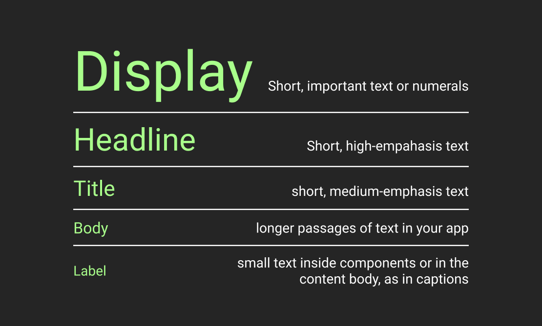
Material You helps organize typography in an app by providing a standard set of 15 typography tokens (or TextStyle, as they are called in Flutter). The tokens are arranged in 5 groups (also referred to as roles, styles, and type styles). Each group has exactly 3 elements (called scales): Large, Medium, and Small.
In my understanding, the main purpose of the tokens is to bear a semantical meaning. However, the official docs only provide semantic descriptions and usage examples for the roles, supposedly, leaving determining the semantics of specific tokens up to us. Besides role semantics, docs also specify the default implementation for each token. Roboto font family is used for every token. Only Regular and Medium weights are used. Where Medium is slightly bolder than Regular.
Now, let's dive into each role semantics, accompanied by examples and specifications!
☝ I put everything I've found in the official docs regarding semantics. If you find the article lacking details, that's just how deep Google decided to go on their website.
⚠️ In the article, a few images showcase different token font sizes. The font sizes are accurate relatively, but not in absolute terms.
Display
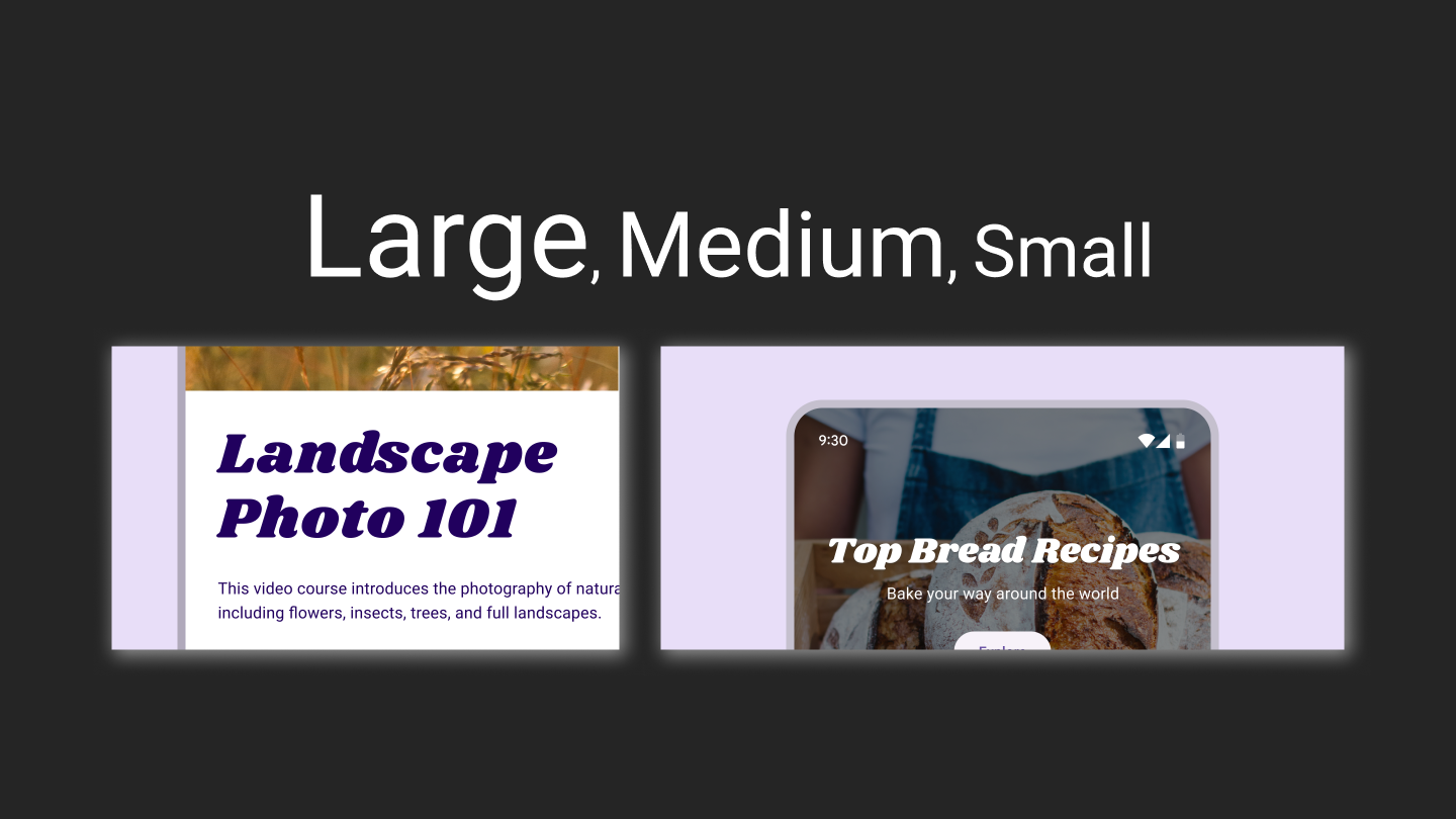
As the largest text on the screen, display styles are reserved for short, important text or numerals. They work best on large screens.
| Token | Font Size | Weight |
|---|---|---|
| Display Large | 57px | Regular |
| Display Medium | 45px | Regular |
| Display Small | 36px | Regular |
Headline
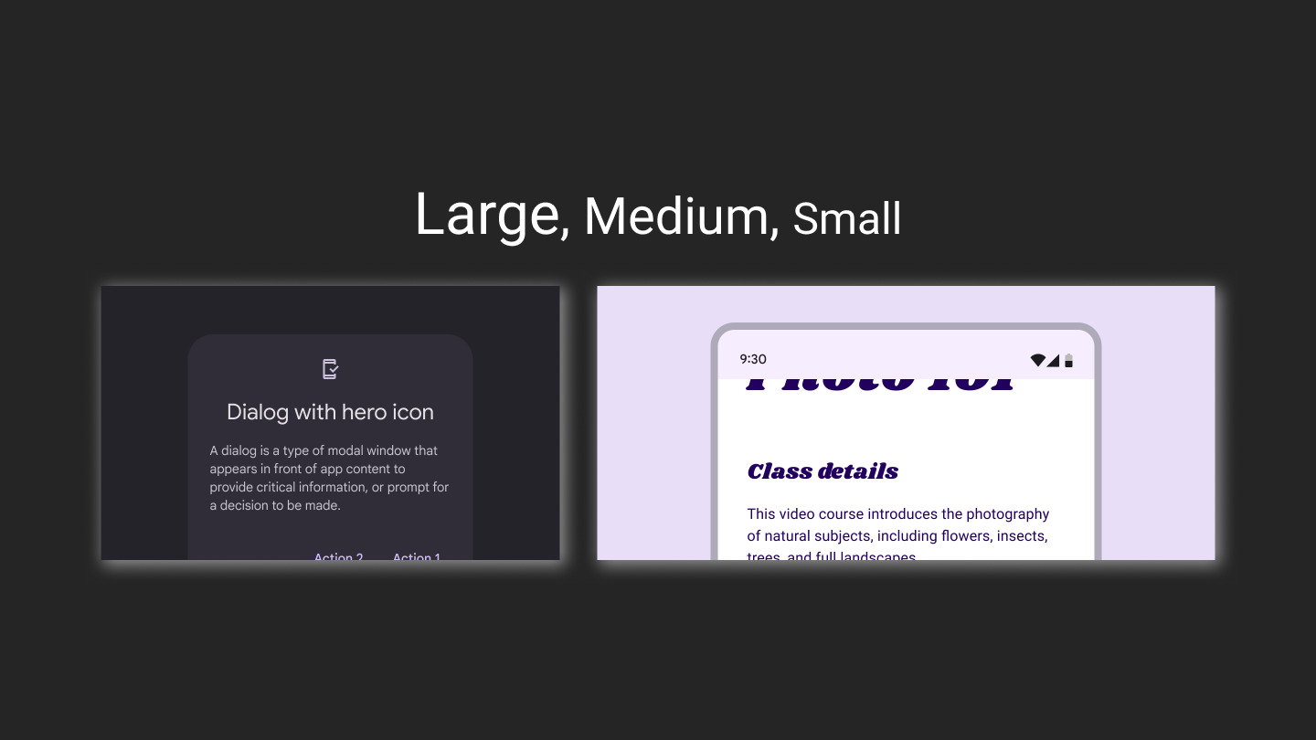
Headlines are best-suited for short, high-emphasis text on smaller screens. These styles can be good for marking primary passages of text or important regions of content.
| Token | Font Size | Weight |
|---|---|---|
| Headline Large | 32px | Regular |
| Headline Medium | 28px | Regular |
| Headline Small | 24px | Regular |
Title
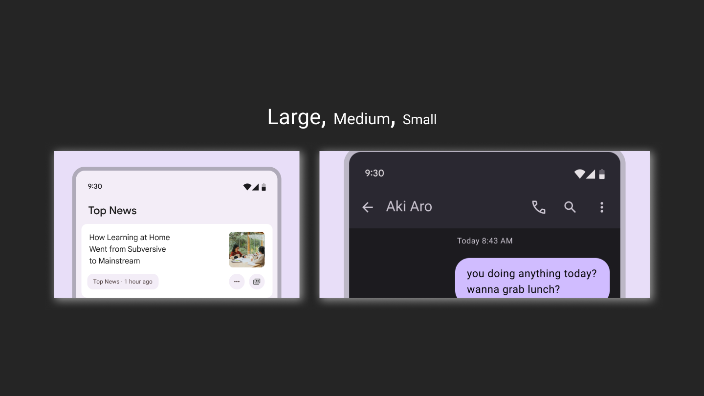
Titles are smaller than headline styles and should be used for medium-emphasis text that remains relatively short. For example, consider using title styles to divide secondary passages of text or secondary regions of content.
| Token | Font Size | Weight |
|---|---|---|
| Title Large | 22px | Regular |
| Title Medium | 16px | Medium |
| Title Small | 14px | Medium |
Body
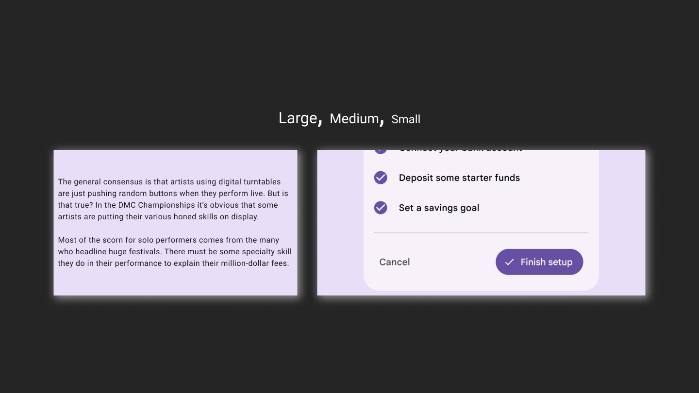
Body styles are used for longer passages of text in your app.
| Token | Font Size | Weight |
|---|---|---|
| Body Large | 16px | Regular |
| Body Medium | 14px | Regular |
| Body Small | 12px | Regular |
Label
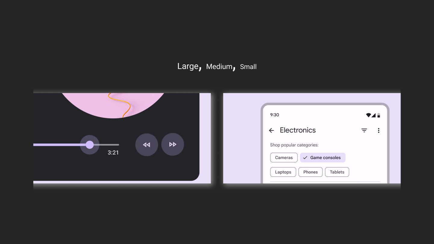
Label styles are smaller, utilitarian styles, used for things like the text inside components or for very small text in the content body, such as captions.
| Token | Font Size | Weight |
|---|---|---|
| Label Large | 14px | Medium |
| Label Medium | 12px | Medium |
| Label Small | 11px | Medium |
Recap
This cheatsheet is essentially an attempt to make the official documentation more readable. Each section corresponds to a Material 3 type style, ordered from the largest to the smallest.
Each section starts with the fonts showcases, accompanied by visual examples. In the continuation I put everything I found in the official docs on the type style semantics. And the TLDR; at the beginning of the article, is just a shortened, one-glance representation of the same information.
Each section ends up with the respecting role tokens specifications. And if you wish for an aggregated specification table, you are in luck, because this is what I'll finish with 😉
| Token | Font Size | Weight |
|---|---|---|
| Display Large | 57px | Regular |
| Display Medium | 45px | Regular |
| Display Small | 36px | Regular |
| Headline Large | 32px | Regular |
| Headline Medium | 28px | Regular |
| Headline Small | 24px | Regular |
| Title Large | 22px | Regular |
| Title Medium | 16px | Medium |
| Title Small | 14px | Medium |
| Body Large | 16px | Regular |
| Body Medium | 14px | Regular |
| Body Small | 12px | Regular |
| Label Large | 14px | Medium |
| Label Medium | 12px | Medium |
| Label Small | 11px | Medium |
By the way ... Claps are appreciated! 👉👈