Flutter DropdownMenu In-Depth
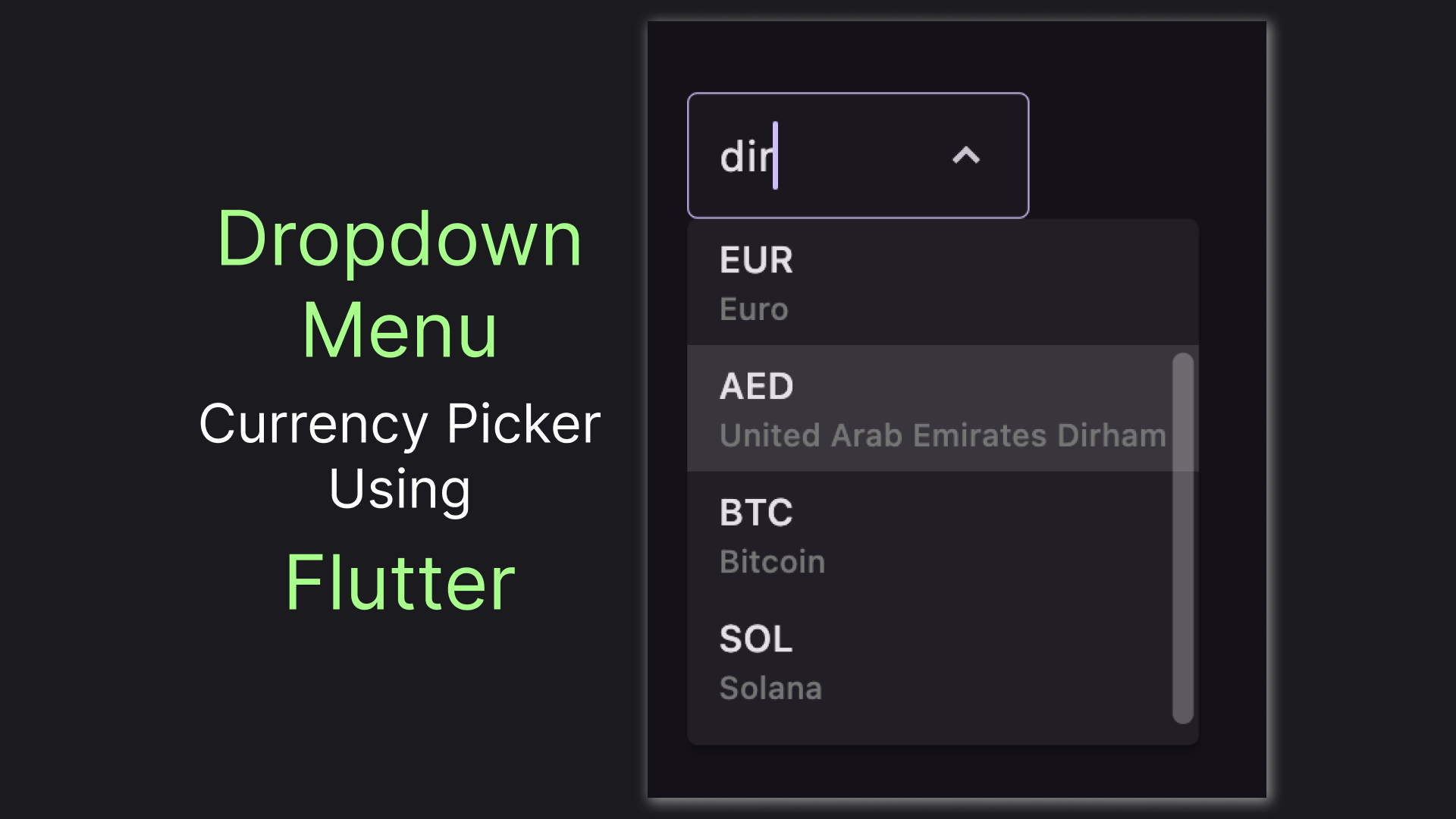
Flutter 3.10 introduced a new dropdown widget: DropdownMenu. This widget is way more versatile than the previously used DropdownButton and Flutter docs recommend to use it over the old widget. Yet there's not much information available on the widget. In this article we'll play around with the widget, investigating its various aspects and functionalities. Let's jump to the code!

Preparing the Basics
How about we build something we can see in a real application? How about a currency picker? I hope this seems fun, so let's define our model and prepare a few options for our picker:
class Currency {
  final String code;

  Currency({
    required this.code
  });
}

List<Currency> currencies = [
  Currency(code: 'USD'),
  Currency(code: 'EUR'),
  Currency(code: 'AED'),
  Currency(code: 'BTC'),
  Currency(code: 'SOL'),
];
With the models prepared let's create a very simple and minimal DropdownMenu
DropdownMenu(
  initialSelection: currencies[0],
  dropdownMenuEntries: [
    for (var currency in currencies)
      DropdownMenuEntry(
        label: currency.code,
        value: currency
      )
  ]
)
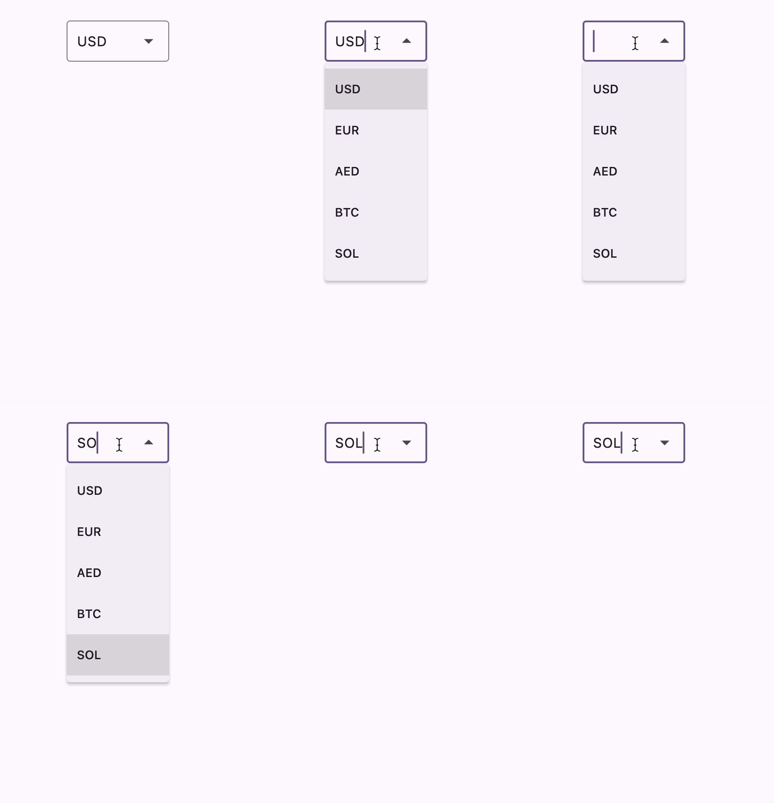
Gladly, the widget is a "battery-included" type of widget, so just the small code gives us nice-looking widget with built-in search:

One of the important aspects of investigating a widget is seeing how we can customize its look, shall we?
Spicing the Looks
By default, a DropdownMenu expands so that all of it's elements are visible. This is not very appropriate for a long list, which a currency list in a real application will be. Gladly, limiting the widget size is just a matter of a single property, so let's use it:
menuHeight: 200,Next, let's walk towards a more minimalistic look for our widget. To my taste, the default arrow icons are slightly obese. To change it we would have to adjust both the down icon (trailingIcon property) and the up icon (selectedTrailingIcon). Here's how the updated version might look:
trailingIcon: Icon(
  Icons.keyboard_arrow_down_sharp,
  size: 20,
),
selectedTrailingIcon: Icon(
  Icons.keyboard_arrow_up_sharp,
  size: 20
),
One other thing we can do to create a more minimalistic look is to make our borders tinier. Note that to properly change the border we should update both enabledBorder and focusedBorder instead of a shared border property as it ignores width and color setups. To still recognize a dropdown with such a tiny border we'll need to set a fill for our widget. Here's the code, combined:
inputDecorationTheme: InputDecorationTheme(
  filled: true,
  fillColor: Theme.of(context).colorScheme.onSurface.withOpacity(0.03),
  enabledBorder: OutlineInputBorder(
    borderSide: BorderSide(
      color: Theme.of(context).colorScheme.onSurface.withOpacity(0.1),
      width: 0.6
    ),
  ),
  focusedBorder: OutlineInputBorder(
    borderSide: BorderSide(
      color: Theme.of(context).colorScheme.primary.withOpacity(1),
      width: 0.6
    ),
  )
)
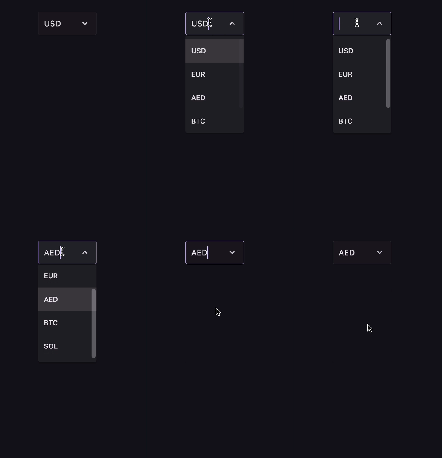
With those customizations, we'll get a widget that looks just a little lighter in my opinion:

Changing widget looks is fun, but a deep understanding of a widget implies we can tweek it's behaviour also. Let's do just that!
Search on Steroids
To do a behaviour customization we first need to have a more complex model. Let's add a name to our currencies:
class Currency {
  final String code;
  final String name;

  Currency({
    required this.code,
    required this.name
  });
}

List<Currency> currencies = [
  Currency(code: 'USD', name: 'United States Dollar'),
  Currency(code: 'EUR', name: 'Euro'),
  Currency(code: 'AED', name: 'United Arab Emirates Dirham'),
  Currency(code: 'BTC', name: 'Bitcoin'),
  Currency(code: 'SOL', name: 'Solana'),
];
To see a currency name we'll need to create our own labelWidget implementation, instead of the default one. Here's an example of how we might do it:
DropdownMenuEntry(
  label: currency.code,
  labelWidget: Column(
    crossAxisAlignment: CrossAxisAlignment.start,
    children: [
      Text(currency.code),
      Text(
        currency.name,
        style: TextStyle(fontSize: 12, color: Colors.grey[600])
      )
    ],
  ),
  value: currency
)
The thing we'll make cooler is the currencies search. Instead of just allowing search by the code we'll implement case-incensitive search by both code and name. Let's add this method to the Currency class:
bool contains(String search) {
  return code.toLowerCase().contains(search.toLowerCase())
    || name.toLowerCase().contains(search.toLowerCase());
}
And utilize it in our custom search logic:
searchCallback: (List<DropdownMenuEntry<Currency?>> entries, String query) {
  return entries.indexWhere((e) => e.value!.contains(query));
},
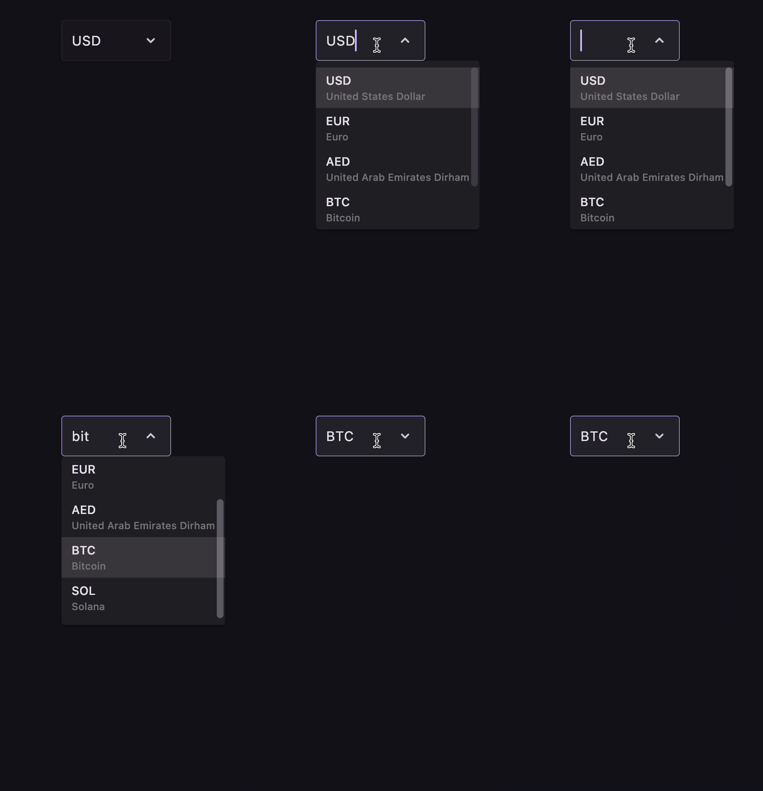
This will give us our final DropdownMenu

This wraps our dive into the world of DropdownMenu, let's wrap it up with a quick recap and a few useful links.
Recap
We've played around with the recommended widgets for creating a selection box: DropdownMenu. We've created a nice and flexible currency picker, learning how to customize both looks and behaviour of the widget along the way. You can find the playground app source code in the Fanci repository, and by the way... claps are appreciated! 👏