Customizing CupertinoDatePicker in Flutter
CupertinoDatePicker is, perhaps, the most minimalistic date picker in Flutter, it not only plays nicely with other iOS-styled widgets but also looks pretty organic with material widgets. Notably, unlike material picker, it can be embedded directly in a form, without a modal window. In this article, we'll investigate different ways of using the CupertinoDatePicker ...and create a better one.
Playing with the Picker
Let's say we have a form with a text field and a date picker:
class CupertinoReferenceTextFieldRow extends StatelessWidget {
  const CupertinoReferenceTextFieldRow({
    super.key,
  });

  @override
  Widget build(BuildContext context) {
    return Row(
      children: [
        const Text('😎'),
        const SizedBox(width: 20),
        Expanded(child: CupertinoTextField(
          placeholder: 'Just a reference text field',
        )),
      ],
    );
  }
}

class DatePickerRow extends StatelessWidget {
  const DatePickerRow({
    super.key,
  });

  @override
  Widget build(BuildContext context) {
    return Row(
      children: [
        const Text('🕒'),
        const SizedBox(width: 20),
        Expanded(
          child: SizedBox(
            height: 80,
            child: CupertinoDatePicker(
              onDateTimeChanged: (value) {},
            ),
          ),
        ),
      ],
    );
  }
}
Wrapping them up in a column and giving them some space
Column(
  mainAxisAlignment: MainAxisAlignment.center,
  children: [
    CupertinoReferenceTextFieldRow(),
    const SizedBox(height: 20),
    DatePickerRow(),
  ],
);
Will give us the following form:
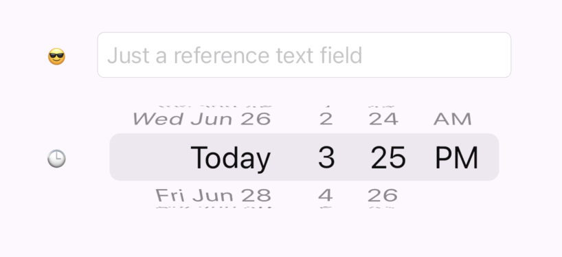
Although that form looks good enough, the fact that it is not aligned by the left side is pretty annoying. Let's figure out what we can do to tune that, studying CupertinoDatePicker constructor:
CupertinoDatePicker CupertinoDatePicker({
  Key? key,
  CupertinoDatePickerMode mode = CupertinoDatePickerMode.dateAndTime,
  required void Function(DateTime) onDateTimeChanged,
  DateTime? initialDateTime,
  DateTime? minimumDate,
  DateTime? maximumDate,
  int minimumYear = 1,
  int? maximumYear,
  int minuteInterval = 1,
  bool use24hFormat = false,
  DatePickerDateOrder? dateOrder,
  Color? backgroundColor,
  bool showDayOfWeek = false,
  double itemExtent = _kItemExtent,
})
Unfortunately, CupertinoDatePicker gives practically no way to customize its look. The only thing we can do is to change backgroundColor and itemExtent, which is not something we were looking for. Why does the widget have margins anyway? Well, we'll need to dive a little bit deeper. CupertinoDatePicker is essentially a set of CupertinoPickers. Let's put a simple CupertinoPicker instead of the CupertinoDatePicker and see what we'll get
CupertinoPicker.builder(
  itemExtent: 30,
  onSelectedItemChanged: (_) {},
  itemBuilder: (context, index) => Text('Item $index')
)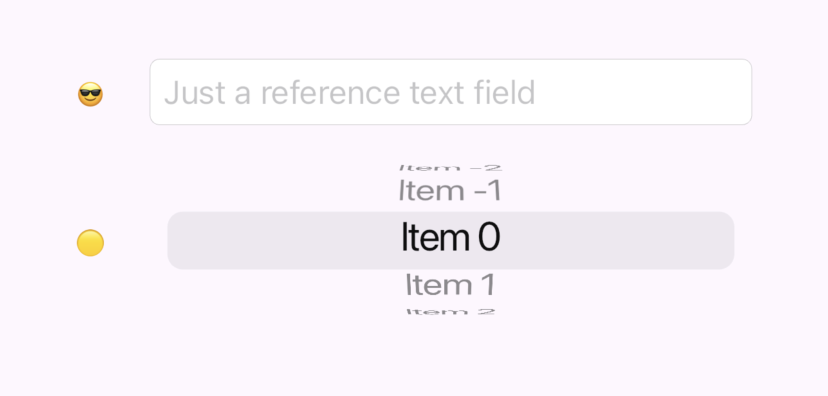
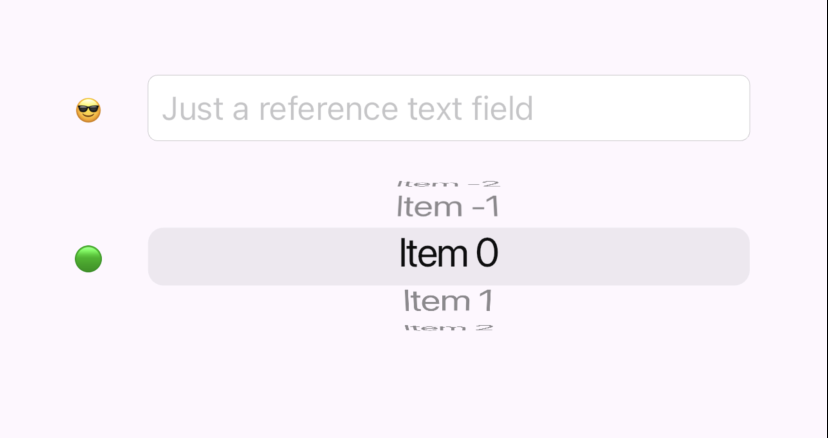
Aha, it's also margined in exactly the same way. This time the picker, provides slightly more opportunity for customization, in particular the selectionOverlay property. If we disable edge capping:
selectionOverlay: CupertinoPickerDefaultSelectionOverlay(
  capStartEdge: false,
  capEndEdge: false,
),
We'll finally get our desired alignment:
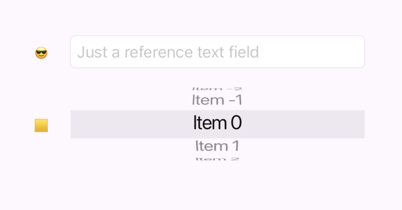
But besides removing the annoying margins we also lost our rounding. This is due to the way CupertinoPickerDefaultSelectionOverlay works:
@override
Widget build(BuildContext context) {
  const Radius radius = Radius.circular(_defaultSelectionOverlayRadius);

  return Container(
    margin: EdgeInsetsDirectional.only(
      start: capStartEdge ? _defaultSelectionOverlayHorizontalMargin : 0,
      end: capEndEdge ? _defaultSelectionOverlayHorizontalMargin : 0,
    ),
    decoration: BoxDecoration(
      borderRadius: BorderRadiusDirectional.horizontal(
        start: capStartEdge ? radius : Radius.zero,
        end: capEndEdge ? radius : Radius.zero,
      ),
      color: CupertinoDynamicColor.resolve(background, context),
    ),
  );
}
Customizing SelectionOverlay
Fortunately, the selection overlay code is trivial, and the selectionOverlay property accepts any Widget. So we can create our own more fluent version. Let's call it just CupertinoPickerSelectionOverlay:
import 'package:flutter/cupertino.dart';
import 'package:flutter/material.dart';

class CupertinoPickerSelectionOverlay extends StatelessWidget {
  final EdgeInsetsGeometry margin;
  final BorderRadiusGeometry borderRadius;
  final Color background;
  final BoxBorder? border;
  static const double _defaultSelectionOverlayRadius = 8;

  const CupertinoPickerSelectionOverlay({
    super.key,
    this.background = CupertinoColors.tertiarySystemFill,
    this.margin = const EdgeInsets.all(0),
    this.borderRadius = const BorderRadius.all(Radius.zero),
    this.border
  });

  @override
  Widget build(BuildContext context) {
    return Container(
      margin: margin,
      decoration: BoxDecoration(
        borderRadius: borderRadius,
        border: border,
        color: CupertinoDynamicColor.resolve(background, context),
      ),
    );
  }
}
Now, applying it to our picker and rounding the border just a little bit
selectionOverlay: CupertinoPickerSelectionOverlay(
borderRadius: BorderRadius.circular(8),
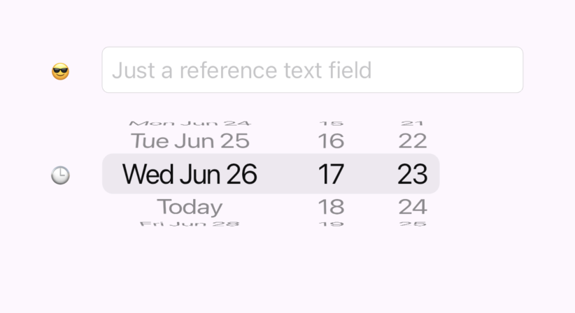
),We'll finally achieve the version we need:
Preparing the assembly line
Well, the date-time picker is not a picker, but a set of pickers. We essentially have 3 pickers, where the first one has its left side rounded, the second one has strict sides, and the third one has its right side rounded. Let's first create helper factories in CupertinoPickerSelectionOverlay:
factory CupertinoPickerSelectionOverlay.roundedLeftSide() {
  return const CupertinoPickerSelectionOverlay(
    borderRadius: BorderRadiusDirectional.horizontal(
      start: Radius.circular(_defaultSelectionOverlayRadius),
    ),
  );
}

factory CupertinoPickerSelectionOverlay.roundedRightSide() {
  return const CupertinoPickerSelectionOverlay(
    borderRadius: BorderRadiusDirectional.horizontal(
      end: Radius.circular(_defaultSelectionOverlayRadius),
    ),
  );
}
Let's first create a widget allowing us to assemble pickers in a single line. The line's selectionOverlay should be drawn based on the SelectionOverlayPosition in the manner we've discussed earlier, essentially:
Widget _buildInlineSelectionOverlay(BuildContext context) =>
    selectionOverlayBuilder?.call(context, SelectionOverlayPosition.inline) ??
    CupertinoPickerSelectionOverlay();

Widget _buildLeftEdgeSelectionOverlay(BuildContext context) =>
    selectionOverlayBuilder?.call(context, SelectionOverlayPosition.leftEdge) ??
    CupertinoPickerSelectionOverlay.roundedLeftSide();

Widget _buildRightEdgeSelectionOverlay(BuildContext context) =>
    selectionOverlayBuilder?.call(context, SelectionOverlayPosition.rightEdge) ??
    CupertinoPickerSelectionOverlay.roundedRightSide();
The widget should also store a selected index for each of the pickers. On a change, the whole set should be presented to a parent widget (in our case that would help to get the selected date, hour, and minute). This is a simple code to implement this:
var selectedIndexes = List.generate(itemsData.length, (index) => 0);

// In each CupertinoPicker
onSelectedItemChanged: (index) {
  selectedIndexes[i] = index;
  onSelectionChanged?.call(selectedIndexes);
}
Putting it together and allowing customizations of itemExtent, item's width, and height we'll get this code:
import 'package:flutter/cupertino.dart';
import 'package:horology/cupertino_picker_selection_overlay.dart';
enum SelectionOverlayPosition {
inline,
leftEdge,
rightEdge,
}
class CupertinoPickerLine extends StatelessWidget {
final double height;
final double itemExtent;
final List<CupertinoPickerLineItemData> itemsData;
final Widget Function(BuildContext, String)? itemBuilder;
final Function(List<int>)? onSelectionChanged;
final Widget Function(BuildContext, SelectionOverlayPosition)? selectionOverlayBuilder;
const CupertinoPickerLine({
super.key,
required this.itemsData,
this.itemBuilder,
this.height = 50,
this.itemExtent = 30,
this.onSelectionChanged,
this.selectionOverlayBuilder,
});
@override
Widget build(BuildContext context) {
var selectedIndexes = List.generate(itemsData.length, (index) => 0);
List<Widget> children = [];
for (int i = 0; i < itemsData.length; i++) {
CupertinoPickerLineItemData item = itemsData[i];
Widget selectionOverlay = _buildInlineSelectionOverlay(context);
if (i == 0) selectionOverlay = _buildLeftEdgeSelectionOverlay(context);
if (i == itemsData.length - 1) selectionOverlay = _buildRightEdgeSelectionOverlay(context);
children.add(
SizedBox(
width: item.width,
height: height,
child: CupertinoPicker.builder(
itemExtent: itemExtent,
onSelectedItemChanged: (index) {
selectedIndexes[i] = index;
onSelectionChanged?.call(selectedIndexes);
},
scrollController: FixedExtentScrollController(initialItem: 0),
selectionOverlay: selectionOverlay,
itemBuilder: (context, index) {
var text = item.itemTextBuilder(context, index);
return text == null ? null : _buildItem(context, text);
}
),
),
);
}
return Row(
children: children,
);
}
Widget _buildInlineSelectionOverlay(BuildContext context) =>
selectionOverlayBuilder?.call(context, SelectionOverlayPosition.inline) ??
CupertinoPickerSelectionOverlay();
Widget _buildLeftEdgeSelectionOverlay(BuildContext context) =>
selectionOverlayBuilder?.call(context, SelectionOverlayPosition.leftEdge) ??
CupertinoPickerSelectionOverlay.roundedLeftSide();
Widget _buildRightEdgeSelectionOverlay(BuildContext context) =>
selectionOverlayBuilder?.call(context, SelectionOverlayPosition.rightEdge) ??
CupertinoPickerSelectionOverlay.roundedRightSide();
Widget _buildItem(BuildContext context, String data) =>
itemBuilder?.call(context, data) ??
Center(
child: Text(data),
);
}
class CupertinoPickerLineItemData {
final double width;
final String? Function(BuildContext, int) itemTextBuilder;
const CupertinoPickerLineItemData({
this.width = 80,
required this.itemTextBuilder,
});
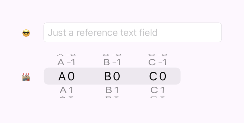
}And this is what we can assemble using that line:
The Final Touch
The CupertinoPickerLine already covers most of the logic we need to create our date time picker. The most fancy logic we have left is bridging the picker selection index to the actual date time. We'll need to convert the distance from the initial value (index) to the actual value.
The logic keeps in mind that our clock is circular e.g. moving 80 minutes away produces the same result as moving 20 minutes away.
var zeroDateTime = initialDateTime ?? DateTime.now();

int hourFromIndex(int index) => (zeroDateTime.hour + index) % 24;
int minuteFromIndex(int index) => (zeroDateTime.minute + index) % 60;

var selectedDateOnly = zeroDateTime.add(Duration(days: indexes[0]));
var selectedHour = hourFromIndex(indexes[1]);
var selectedMinute = minuteFromIndex(indexes[2]);
var selected = DateTime(
  selectedDateOnly.year,
  selectedDateOnly.month,
  selectedDateOnly.day,
  selectedHour,
  selectedMinute
);
One more cherry on top of fancy logic is the logic of rendering the picker date. Which includes showing "Today" for the current date:
var localization = CupertinoLocalizations.of(context);
var selectedDate = zeroDateTime.add(Duration(days: index));
var selectedDateString = localization.datePickerMediumDate(selectedDate);
var nowDateString = localization.datePickerMediumDate(DateTime.now());

if (selectedDateString == nowDateString) return localization.todayLabel;

return selectedDateString;
Okay, let's pack it up in a widget. What could we name it? Fortunately, CupertinoDateTimePicker (which is a more precise name in my view) is not occupied by the built-in flutter libraries, so, let's just use it:
import 'package:flutter/cupertino.dart';
import 'package:horology/cupertino_picker_line.dart';

class CupertinoDateTimePicker extends StatelessWidget {
  final Function(DateTime)? onSelectionChanged;
  final DateTime? initialDateTime;
  final Widget Function(BuildContext, SelectionOverlayPosition)? selectionOverlayBuilder;
  final double height;

  const CupertinoDateTimePicker({
    super.key,
    this.onSelectionChanged,
    this.initialDateTime,
    this.selectionOverlayBuilder,
    this.height = 50,
  });

  @override
  Widget build(BuildContext context) {
    var zeroDateTime = initialDateTime ?? DateTime.now();

    int hourFromIndex(int index) => (zeroDateTime.hour + index) % 24;
    int minuteFromIndex(int index) => (zeroDateTime.minute + index) % 60;

    return CupertinoPickerLine(
      height: height,
      selectionOverlayBuilder: selectionOverlayBuilder,
      onSelectionChanged: (indexes) {
        var selectedDateOnly = zeroDateTime.add(Duration(days: indexes[0]));
        var selectedHour = hourFromIndex(indexes[1]);
        var selectedMinute = minuteFromIndex(indexes[2]);
        var selected = DateTime(
          selectedDateOnly.year,
          selectedDateOnly.month,
          selectedDateOnly.day,
          selectedHour,
          selectedMinute
        );

        onSelectionChanged?.call(selected);
      },
      itemsData: [
        CupertinoPickerLineItemData(
          width: 130,
          itemTextBuilder: (context, index) {
            var localization = CupertinoLocalizations.of(context);
            var selectedDate = zeroDateTime.add(Duration(days: index));
            var selectedDateString = localization.datePickerMediumDate(selectedDate);
            var nowDateString = localization.datePickerMediumDate(DateTime.now());

            if (selectedDateString == nowDateString) return localization.todayLabel;

            return selectedDateString;
          },
        ),
        CupertinoPickerLineItemData(
          width: 80,
          itemTextBuilder: (context, index) {
            var hours = (zeroDateTime.hour + index) % 24;
            return hours.toString().padLeft(2, '0');
          },
        ),
        CupertinoPickerLineItemData(
          width: 40,
          itemTextBuilder: (context, index) {
            var minutes = (zeroDateTime.minute + index) % 60;
            return minutes.toString().padLeft(2, '0');
          },
        ),
      ],
    );
  }
}
Using our updated date time picker is even simpler than the built-in one. Here's what the field row code looks like now:
Row(
mainAxisAlignment: MainAxisAlignment.start,
children: [
const Text('🕒'),
const SizedBox(width: 20),
CupertinoDateTimePicker(
height: 80,
initialDateTime: DateTime.now(),
onSelectionChanged: (value) {
print(value);
},
),
],
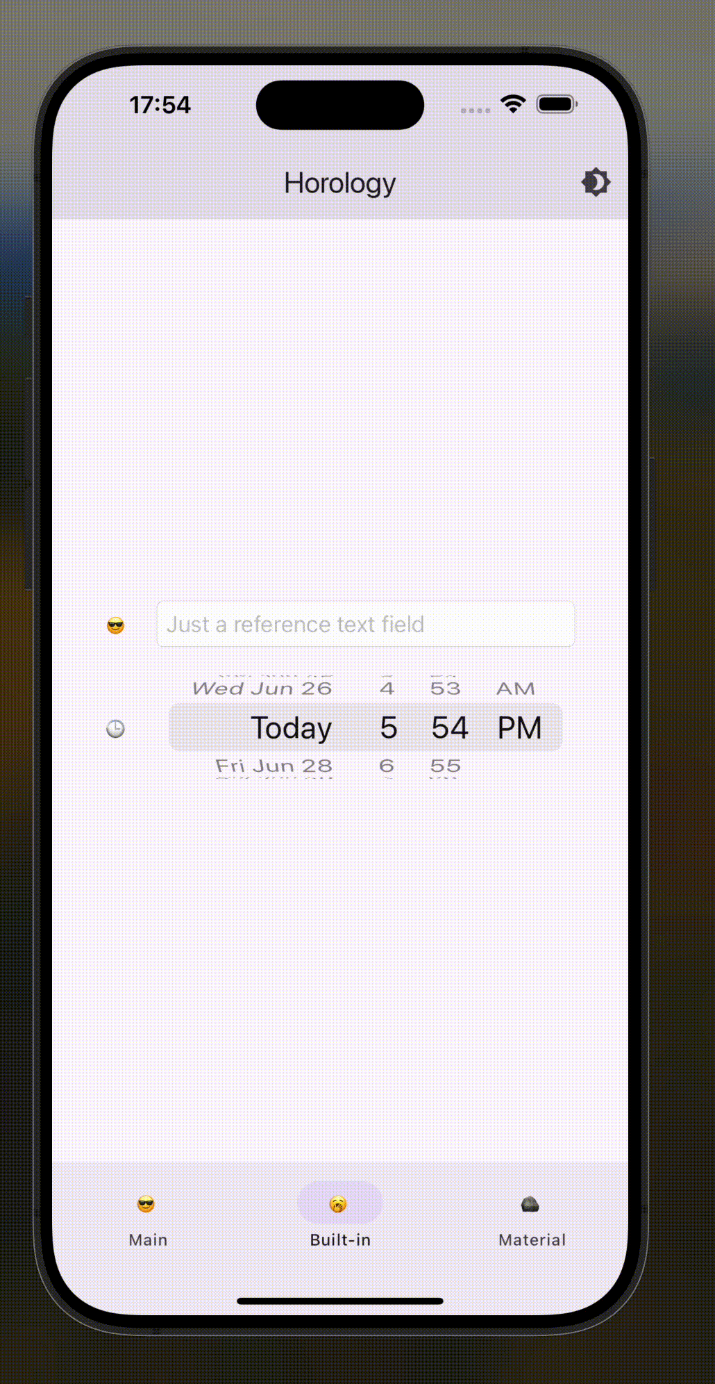
);And finally here's our fresh, aligned look:
The result
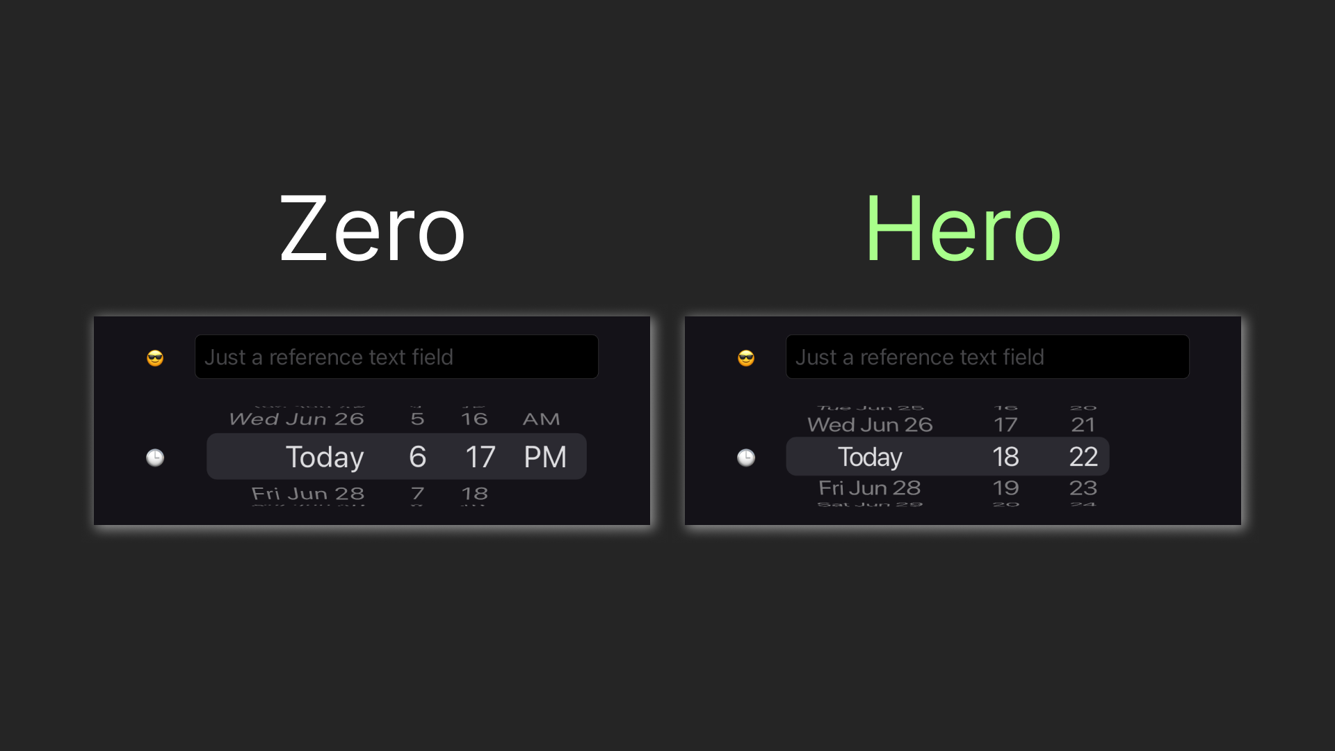
We've investigated CupertinoDatePicker and found out its limitations. To overcome those, we went with creating our custom CupertinoDateTimePicker, crafting CupertinoPickerSelectionOverlay and CupertinoPickerLine along the way. Here's our journey in a gif:
You can find the playground app code in this repo. You can also get CupertinoDateTimePicker by adding this package as a dependency.
And one more thing... claps are appreciated 👉👈